How Far Back in Time Can I Take My Website's Design
They say that a builder's home is never finished. This saying is certainly true of the website you're reading right now. All too often I find myself tweaking the padding of list elements, carefully calibrating the ratios between heading sizes, or painstakingly fussing over the contrast between different shades of green. All in an effort to make the site more 'readable'. After all, I don't want the task of reading this blog to any more painful for my dear readers than it needs to be.
In this pursuit of 'readability', I've done my best to keep the site's design as straightforward as I can make it1. The content is squeezed into a single column as wide as the eyes can comfortably scan. There are no complex sidebars, calendars, or tag clouds cluttering up the layout, and the colour palette is chosen to minimise eye strain when reading in a darkened room.
Recently I read this great article from interface designer Anthony Hobday, in which he lays out a list of easy
to follow visual design rules that even a design-challenged technical person like myself can understand. I blame credit this article for inspiring me to (yet again) roll up my sleeves
and get stuck into this blog's design.
Between pruning container divs and removing collapsed margins the thought occurred to me that my site —with its spartan design and low-tech philosophy— could have remained pretty much identical since the internet's early days. This raised an interesting question: Exactly how far back in time could my site's design have remained the same? How far in the past could this site's current design have originated? 5 years? 10 years? more?
The only thing to do now would be to put this strange idea to the test. What follows is a tedious account of my trial and error doing just that.
If you're not interested in the technical play-by-play of testing my site against vintage browsers, feel free to skip ahead to the end section for some more personal content about my nostalgia for the web's early days, and what the small web means to me.
A Few Ground Rules #
Before I begin, I should establish a few rules...
The challenge is to amend the markup so the site —as it looks now— works on browsers from the past, not to come up with a good design that worked back then and now.
The site needs to look more or less identical to the current design, on both contemporary, and modern browsers. It would be no good after all if I managed to make my site display correctly on antiquated browsers, only to have my dear modern audience (you) suffer for it today.
Of course, there are some things I know will just never work no matter how much effort is applied, so I'm willing to make a few small compromises here and there, as long as the design of the site remains more-or-less identical.
My site doesn't use any Javascript. For this reason I've decided not to consider any solutions using Javascript trickery to resolve compatibility issues.
With the rules established, there was nothing left to do but jump right in. I'll dial the clock back five years at a time, documenting the difficulties as I go. Without any further ado, let's take a walk down memory lane...
2008: T Minus 15 Years #
As it turns out, we have to dial the clock back 15 years before anything interesting starts happening.
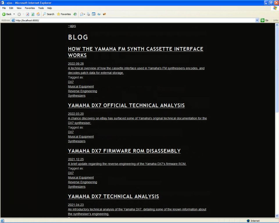
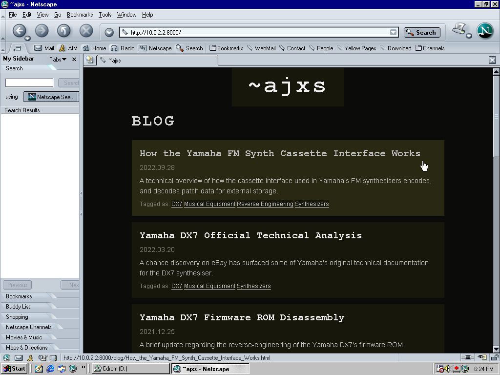
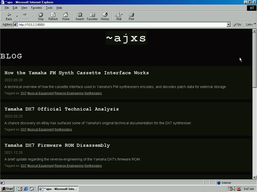
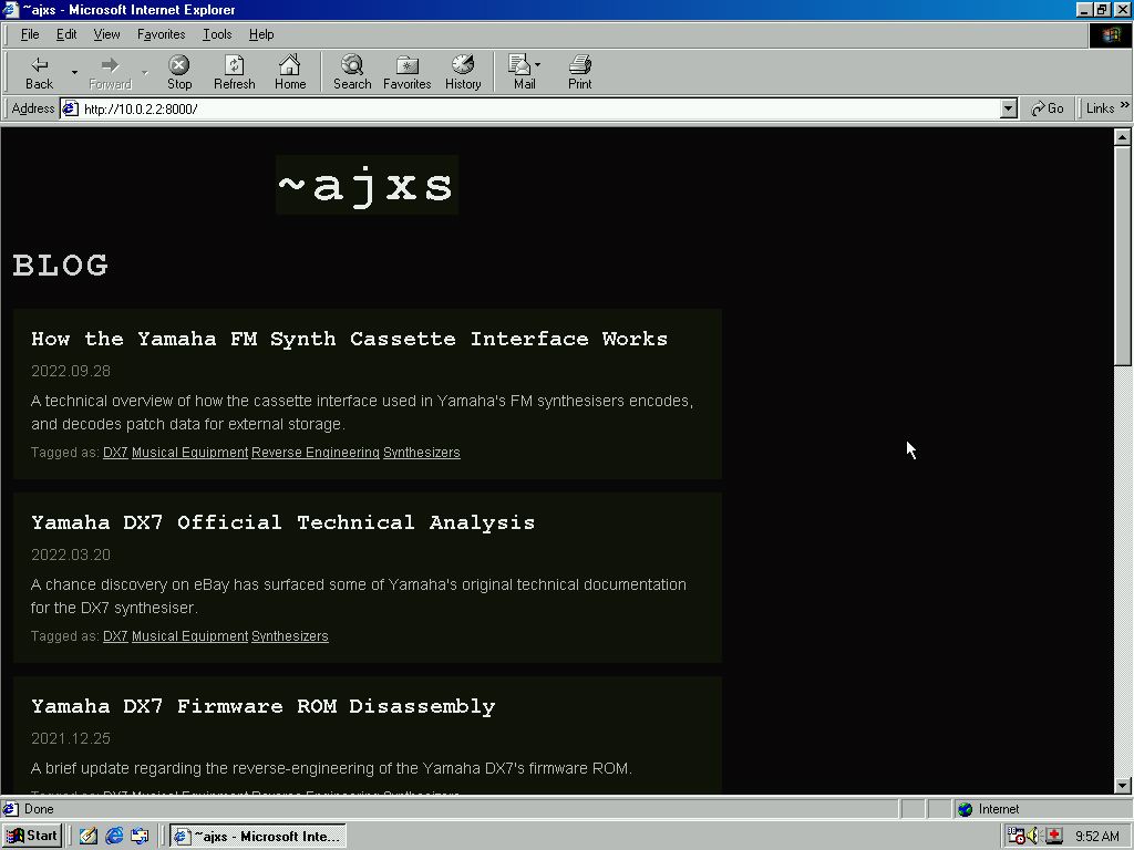
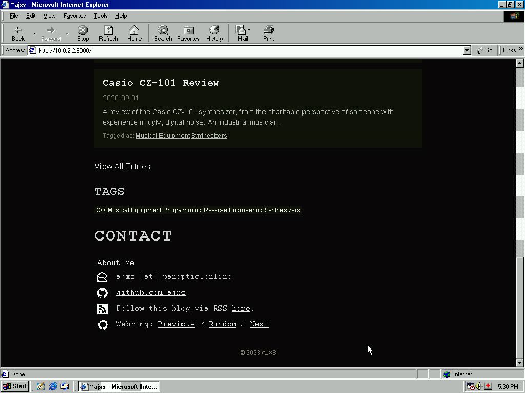
The year is 2008. Google have just released the beta of their new Chrome browser, and a much less cynical world is excited at the prospect of anything but Microsoft. Stack Overflow has just launched, and YouTube still looks like this. The cutting edge browsers on the market are Internet Explorer 7.0 and Firefox 3.0. AOL had very recently announced that they would be ending all support for the ailing Netscape Navigator, giving their users an endorsement of Firefox as a parting gift.
Firefox 3.0
For what it's worth, I was an early Firefox adopter, and had already been a faithful user for several years by this point. While it wasn't the first browser to feature a tabbed interface, Firefox's reintroduction of tabs to the new generation of web browsers was an absolute game changer.
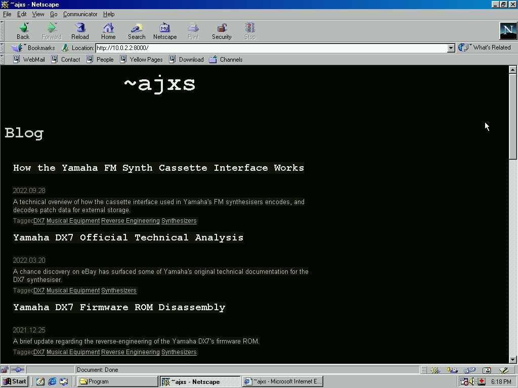
Problem: Content Container Styling
 Status: Solved
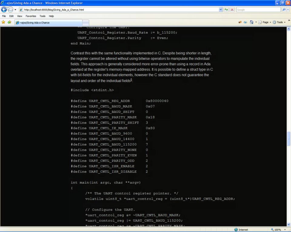
The cause of these layout problems didn't take long to track down: The 'rem' unit wasn't even part of the CSS standard in 2008. After converting them to 'px' with some crude 'Find+Replace' wizardry, things were starting to take shape.
Funnily enough, even though no styling was actually applied to the blog item headings, the browsers falling back to their default heading styles made the page largely resemble its intended design. I guess my pedantic adherence to semantic markup might actually pay dividends after all.
Problem: Mangled Page Header
 Status: Solved
This turned out to be the result of Firefox applying a default inline style to the unsupported HTML5 <header> element.
How browsers should, or even do actually handle unknown HTML elements is a matter of serious conjecture in the web design community. Reading the actual WHATWG specification for how this should work isn't for the faint of heart either. Understanding the standard wouldn't help us much at any rate, as the first browsers to support these rules would actually be Firefox 4.0, and Internet Explorer 10.
Fortunately, Mark Pilgrim's fantastic Dive Into HTML5 has a comprehensive guide to how this actually works in practice across different browsers.
Problem: <figure> elements not styled correctly
 Status: Unresolved
The <figure> elements I had used in several articles were not rendering correctly either for the same reason as the difficulties I experienced above with the page header.
Each of the individual entries in this blog is composed in plain HTML and stored in an SQLite database, before being rendered into the final product by my homegrown static-site generator. Rather than removing the <figure> tags from each individual article, I decided that I would just have to live with this problem and move on.
Internet Explorer 7
Switching back to Internet Explorer, it was clear much more work needed to be done.
Problem: Blog Index Styling

 Status: Solved
At first I suspected there was no way IE7 supported the 'child combinator' CSS selector I was using to style the blog index's entries. It turned out I was underestimating Internet Explorer's CSS support. A mistake I'd make more than once writing this article.
After a quick session of debugging trial and error I figured out this was another instance of the browser not recognising HTML5's futuristic semantic markup elements. As Mark
Pilgrim's 'Dive Into HTML5' guide notes, when encountering an unknown HTML element Internet Explorer not only doesn't apply any styling to it, it doesn't apply styling to any of its
descendants either!
Changing the <section>, and <article> tags back into plain old <div> elements resolved these issues. Internet Explorer also added a default margins for lists, which I took the opportunity to reset.
Problem: Inline-Block List Elements
 Status: Solved
'Inline-block' elements, such as the front page tag list, were being rendered as block. Between Firefox rendering block HTML5 elements inline, and IE rendering inline elements as block, it was all getting very confusing.
Adding the zoom: 1; *display: inline;
hack as per
this helpful page
from Mozilla resolved the issue. Somehow this doesn't seem to have any side-effects on other browsers, thankfully.
Problem: Table Of Contents Item Numbering
 Status: (Partially) Resolved
After putting in way too much time debugging, it looks like my use of the
counters() function was breaking IE7's CSS parsing, causing it to stop applying any subsequent
definitions from the stylesheet. Unsurprisingly, this caused a great load of other problems, like breaking the TL;DR block and code snippet styling.
This function is used to create the item numbering in the 'Table of Contents' section used in articles. Unlike the native list-style property, using CSS counters allows creating
numbering for the nested sub-lists, such as 2.1.1., and so forth.
I tried various hacks to get this across the line. All in vain. Even using Internet Explorer's dreaded 'Conditional Comments' to include an IE-specific stylesheet couldn't accomplish much. This interesting article provides an extremely clever hack for implementing CSS numbering in early IE versions, however it seems fragile, and more work than it's worth. My options here seemed somewhat limited.
After a lot of testing, it turns out that the
counter()
function (As opposed to counters) doesn't actually cause the same issue. Unfortunately this doesn't get us any closer to actual numbering, as IE7 and below didn't even support the ::before, and
::after CSS pseudo-elements, or the content property used to place the numbering in the first place. This solution also doesn't allow for the
'recursive' sub-list numbering on browsers that actually support counters, which was the whole point of using the function over the native list styling in the first place.
After way too much messing around, I decided the best compromise was to revert to using the native list-style to number the Table of Contents items. This allowed for
some numbering in both IE7, and other browsers. I apologise to anyone still suffering through this article.
As if just to heap insult upon injury, the CSS outline property isn't supported
in IE7 either, so my stylish double-border isn't going to show up either. I guess I'll just have to live without that one. Surprisingly, CSS counters were actually
supported
in IE as far back as 2009, so we only just missed out.
2003: T Minus 20 Years #
Back in 2003 the browser landscape was like the wild-west. The browser wars were raging, and the internet was still an untamed frontier to be won. Browser vendors forged ahead on their own, breaking new ground wherever they could, resulting in such regrettable elements as <marquee>, <layer>, and even the infamous <blink>.
2003 would also see web developers Matt Mullenweg and Mike Little release the first version of the Wordpress Content Management System into the wild, irreconcilably entrenching PHP into the legacy of the entire internet. In case you're looking for who to blame, it's them.
Internet Explorer 6.0
After dialling the clock back a full 20 years, things really began to fall apart.
Problem: Main Page Styling
 Status: Solved
At this point Internet Explorer 6 wasn't styling the front-page blog entries at all. I had a hunch, based on caniuse.com's suggestion, that this could be due to IE lacking support for the <ul> element...
It turned out that this time it was actually IE's lack of support for the child combinator CSS selector. This now meant that I needed to explicitly prevent the nested 'tagged as'
lists from picking up the styling of the main blog index entries. No problem, I guess. However this caused an issue on modern browsers where the nested lists do not behave correctly when the
main blog index item is hovered. To remedy this without using child combinators I had to make judicious use of the background-color: unset; property on the nested list items. I
guess that this is the kind of thing that still inspires hate for CSS.
Problem: Index Entry Items Don't Highlight on Hover
Status: Unresolved
Unfortunately IE6 doesn't support the :hover CSS selector on arbitrary elements, so the front-page index blog entry elements no longer highlight when hovered over. I'm sure this
would be easily resolvable with Javascript, but since that's out of the question we'll unfortunately just have to push on without it.
Wrapping the entire index entry item in a link, and nesting the tag links creates all kinds of chaos, so we won't be considering that either.
As the previous link notes, it's definitely possible to use some CSS positioning trickery to make the links appear visually nested. This is just a little bit too hacky for me
though. This kind of CSS layout crime wizardry was definitely a hallmark of early 2000s web design, with its ubiquitous
three column layouts
precariously held together with the CSS equivalents of thumb-tacks and duct-tape. The Flexbox CSS layout method would eventually make this much more straightforward, but setting up a good
vertical navbar in the 90s/00s was no laughing matter.
Problem: Transparent PNG Support
 Status: Solved
PNG transparency isn't supported in IE6. Unfortunately, there just wasn't anything else (reasonable) to do but convert the PNG images to transparent GIFs. Some quick imagemagick got the job done in no time, although the anti-aliasing effect of the PNG alpha channel is gone. I guess we can just make do like it's 2003 and live with that.
Being confronted with the ghastly results of my hasty solution brought back memories of tweaking GIF image palettes in Paint Shop Pro (back when it was still owned by Jasc). It was pretty much standard in those days for any respectable site to have a page-width banner image in their header, and —of course— optimising them was serious business. Contemporary experts advised web designers to set total page size budgets stretching into the hundreds of kilobytes, the lion's share of which was often totally superfluous banner imagery.
Thankfully those days of bloated, image heavy layouts are long gone... Only to be replaced instead by hundreds of kilobytes of bloated Javascript frameworks and analytics libraries. This epidemic of overweight websites has steadily declined into what the brilliant Maciej Cegłowski has so aptly titled The Website Obesity Crisis. In response to this worrisome trend, various sites have emerged encouraging those of us in the developer community to put our designs on a diet. Among them, the 1MB Club, 512kB Club, 250kB Club, and the truly daring 10kB Club. I don't quite make the cut for the latter, tipping the scales somewhere around the 20kB mark. Maybe this can be my next home-improvement project?
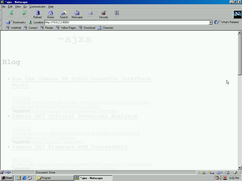
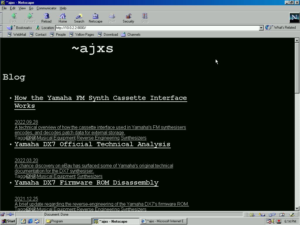
Netscape Navigator 7.0
I didn't even have to wait for the Netscape 7.0
installation
to finish before I'd start feeling nostalgic. The offer to install RealPlayer and Winamp was truly a blast from the past.

Problem: Tag Item Hovered Background Colour
 Status: Unresolved
Unfortunately, the issue I tackled above with the nested lists not picking up their parent list item's highlighted colour on hover was reoccurring in Netscape. The fix I used earlier of removing any implicit background colour didn't seem to accomplish anything here. Surprisingly, aside from this everything else was totally fine, so I was happy enough to write this one off and move on.
As a side note, look at that interface! Check out the icons in the lower left-hand corner!
1998: T Minus 25 Years #
Internet Explorer 5.0
To veterans of the browser wars, any mention of 'cross-browser compatibility issues' brings to mind one culprit in particular: Internet Explorer.
I certainly remember burning the midnight oil painstakingly aligning div elements in Firefox, only to see my work reinterpreted as abstract art by the quirks of IE's layout engine.
In all fairness, the collective 'folk history' of the web has been a little unfair to Internet Explorer. In his amazing talk 'Hindsight can be 50/50', Jay Freeman makes a very convincing case that Microsoft might not actually have been the villain of browser history we all remember them to be. He lays out a very compelling argument that Microsoft actually adhered much more closely to the W3C's specifications than their competitors, and were arguably no worse corporate citizens than their contemporary rivals. I recommend everyone give this incredibly well-researched, eye-opening presentation a watch.
The more research I did for this article, the more I realised the history of internet browsers is actually much more interesting and nuanced than I'd expected, and far too big for me to do any justice to here in this article. Jay Hoffmann's The History of the Web, provides a wonderfully written chronicle of the web's history. Anyone interested in understanding the historic decisions and personalities that shaped the web of today should definitely give it a read!
Getting a copy of Internet Explorer 5 up and running turned out to be more involved than I'd expected. Up until this point I'd been using BrowserStack to test the site in different browsers, but IE5 was unfortunately a bit beyond the selection they offer. I ended up taking a much bigger trip down memory lane than I'd anticipated, running the browser inside a VirtualBox instance running Windows 98. This trick made accessing my local development environment from Virtualbox a piece of cake.
Problem: Main Page Content Container
 Status: Solved
On first load, the main centre column layout was stretched to the page width. This is because IE5 doesn't support applying a width rule to the page's
<body> element. Wrapping the main page content in a div solved the issue of the content container. However now it's incorrectly aligned...
 Adding
 text-align: center; to the main body element as per this solution put it
back where it was supposed to be.
Problem: Image Maximum Size
 Status: (Partially) Solved
Unfortunately the max-width CSS property of block elements didn't exist in 1998. It was added as part of the
CSS 2.1 specification in 2010. I remember how revolutionary this CSS property was. It allowed designers to free themselves from so
many precarious hacks!
After trying a dozen different approaches in vain, I resorted to using an IE-specific stylesheet, imported using a 'Conditional Comment' in the page's header. Prior to writing this article I had actually completely forgotten this functionality even existed. With any luck, I may forget again.
In a few blog articles I'd used the HTML5
Figure
element to wrap captioned images. Attempting to select any <img> element inside a <figure> element with CSS wasn't going to work. As mentioned earlier,
Internet Explorer won't style any unknown elements or their children. Adding a rule to my new IE-only stylesheet to set a fixed width for any image inside the entry body somehow seemed to do
the trick.
Granted, this isn't really a maximum image width, but this patchy solution does solve the issue. As far as I'm aware all of the thumbnail images in my article are above the maximum image size, so no stretching will actually occur.
Problem: Inline-Block Elements
 Status: Solved
Removing the inline block list elements that wrap the anchor elements resolved some issues.
Netscape Navigator 4.5
I can't remember how exactly I got introduced to the internet, but I do know that the first time I saw it was through a Netscape Navigator2 window. While I am getting a bit long in the tooth now, I'm not quite old enough to have had to worry about Netscape's share of CSS issues. Now was my chance to catch up on all the fun I missed...
For much of this section, I will be referring to RichInStyle.com's bug guide. This fantastic resource contains an exhaustive list of contemporary browser bugs.
Problem: Background
 Status: Solved
The CSS3 Background module draft specification recommends that "authors specify the background for the BODY element rather than the HTML element". Doing just that restored the page's lost background colour.
Problem: List Items
 Status: Solved
Now that we have a background colour again, it's plain to see that something is going really wrong with the front page blog index styling. It turns out Netscape doesn't like the way I
constructed the main blog index out of a list element3. Converting the individual index entry items from <li> to <div>
resolved the issue.
Problem: Background Only Applied To Text
 Status: Solved
Once again, I have RichInStyle.com to thank for a solution that may have taken me years to find on my own. Apparently this ghastly effect is the result of a bug in Netscape 4.x. Adding the
border: none property to elements resolved this issue.
Problem: Body Font Color
 Status: Solved
This problem was solved by explicitly adding the font colour property to all of the relevant elements, one tedious definition after another.
Problem: Centre Div
 Status: Unresolved
According to RichInStyle.com, "Auto is interpreted as 0", so the modern solution of margin: 0 auto won't accomplish anything in Netscape.
As a battle-scarred veteran of the browser wars, I recalled the old trick of combining an absolute position and a negative margin, such as:
position: absolute; left: 50%; margin-left: -320px;
However all this accomplished was pushing the centre column halfway off the page, as Netscape 4.5 doesn't seem to support negative margins.

In desperation I even tried using Netscape's dreaded
<center>
tag, rendered erroneously in the Queen's King's English as <centre>. I may as well have left it that way for all the good it did me.
Grasping at straws, I tried adding the align="center" attribute, as suggested
here, to no avail. There's only so much time I'm willing to spend solving this
particular problem. With heavy heart, and with my remaining patience quickly evaporating, I decided to let this one go.
Problem: Image Size
 Status: Solved
Having barely mentally recovered from the last frustrating issue, I was willing to consider more expedient approaches to solving any further problems. I figured there was no need to complicate matters any further, so I manually resized the image files to their final, correct size. I'm not even sure why I hadn't done this already.
To align the newly resized images correctly I resorted to using a <table> element. Very naughty. The only way this could be any worse would be using transparent
'spacer' images to nudge things around.
1993: T Minus 30 Years #
Okay, so I didn't do such a good job back there in 1998 with Netscape... In my defence —as pointed out by
Wikipedia— CSS adoption before the turn of the millennium was patchy at best. Good thing that
where we're going, we don't need have CSS...
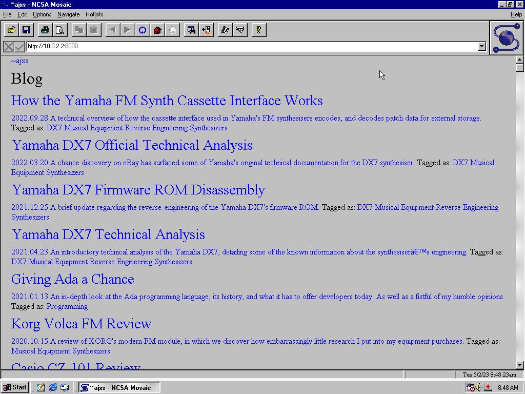
NCSA Mosaic 1.2
Laugh if you must, but I'm genuinely surprised that tracking down copies of the internet's earliest browsers is as hard as it was.
After searching high and low, I stumbled upon 'Ancient Web Browsers', an amazing catalogue of the web's earliest browsers. Note the availability of binaries for a wide variety of contemporary platforms, such as NeXT, DEC, RS6000, SGI, and SPARC.
The novelty of testing my site against Mosaic didn't take long to start wearing off. The whole problematic endeavour was complicated, not the least of which, by the fact that the Mosaic browser actually predates the HTTP 1.0 specification. Meaning that some modern webservers will have some trouble honouring its requests.
Firing up
NCSA Mosaic 2.1 for Windows
in my Windows 98 VM was much less of a headache, but my conscience simply wouldn't permit me passing this off as the real deal. With my journalistic integrity intact, I pressed onward...
For the sake of expediency, I ended up building xmosaic from the source available here. A few tweaks were needed for
it to build on a modern Linux distro, but this didn't take too long. On account of being Mosaic for X, it takes its colour-scheme from
my
~/.Xresources file, rendering Mosaic in an all but unusable state.

After quickly cobbling a new X colour-scheme together, I was ready for the next challenge...
Problem: Everything
 Status: Impossible
Well... I just had to see for myself. Of course, any attempt to get my site rendering —in a reasonable fashion— in the Mosaic browser was absolutely doomed from the start. If for no other reason than the fact that, at this point, CSS wouldn't be created for another three years. On account of this limitation, no amount of bending, bashing, or technical trickery could ever make my site display correctly in Mosaic.
Working backwards through the history of internet browsers, it's interesting to see how quickly the design of the world-wide-web crystallised into something we'd recognise today as the modern internet. And on that note, how little the concept has changed overall. While the complexity of online user-interfaces may have converged with that of traditional desktop applications, the original UI/UX paradigm of just clicking on text remains the dominant way of interacting with the web. A time traveller from 1993 would definitely be dazzled by a site like YouTube, Netflix, or Amazon, but beneath the all the rich and colourful multimedia they'd still find a familiar interface.
A mirror of my site, with the amended markup created in the writing of this article, is available for a limited time at ajxs.xyz.
Nostalgia and The Small Web #
Not the least among my many follies is a tragic sentimentality for the internet of my teenage years. A wistful nostalgia for a less cynical age of technological optimism. When the world-wide-web was the creative, secret domain of an emerging cyberpunk counterculture. An era when artists4, entrepreneurs, and activists alike were excited at the prospect of a technological future, ripe with the potential to empower mankind's finest qualities. Before the eternal September of the social media age, and before the Patriot Act, PRISM, or the emergent 'Big Tech' oligarchy and its corporate panopticon.
Paradoxically, for many people the internet seemed a much bigger place when it was smaller. The cyberspace of the 90s/00s seemed like the private canvas of an entirely new kind of artist. Fertile ground where a generation of hackers could explore new, emergent forms of creativity. Where they could find a sense of belonging, interacting with highly personalised spaces designed by like-minded individuals the world over. Despite modern technology empowering more people than ever to access the internet, a growing number of users feel that the internet of today has stopped being a personal space at all. Rather than empowering users with a blank canvas for their imagination, today's internet has become a place where users are acted upon. Certainly no one would ever expect that Googling a particular topic would ever find them the personal, creative work of an individual anymore. Users have increasingly become accustomed to a corporate internet, consisting primarily of platforms seeking to commodify their attention, or monetise their interactions in increasingly exploitative, predatory ways.
I'm not alone in feeling this way. A growing movement of online content creators is working to reclaim the feeling of a more personal, artisanal internet. A community of retro websites has blossomed around Neocities; Webrings are re-emerging in the wild; and entirely new protocols have been devised to recapture the feeling of the internet's earliest days. One name for this movement that I particularly like is 'The Small Web', popularised by Parimal Satyal's wonderful essay 'Rediscovering the Small Web'. Others have written amazing material about rediscovering the user-centric 'small-web', such as Ben Hoyt's 'The small web is beautiful', or this essay by Aral Balkan.
This movement to recreate the small-web isn't just concerned with the web as an artistic medium, but also the philosophical, environmental, and political implications of an increasingly connected world. A growing concern for many is the increasing concentration of power in only a handful of online content platforms, and the emerging issue of sovereignty over their own data. Entire communities have sprung up dedicated to self-hosting their own infrastructure, and the federation of these platforms. Concern about the increasing technological complexity of web design, and the internet as a whole, has driven a resurgence in simpler, 'static' sites and the use of static-site generator frameworks such as Hugo.
In defence of my nostalgia, I was there.
Like so many other children of the 90s, I didn't need any convincing when it came to the internet, I just got it, and as soon as I realised I could create pages of my own, I wanted
in. Somewhere in the middle of putting a primary-school assignment together I discovered that I could use Microsoft Publisher 98 to build HTML pages. Instantly I was hooked.
My family didn't even have the internet at home and yet there I was, designing a website of my very own. I had absolutely no idea how I'd actually get it online, but that didn't slow
me down for a second. Eventually I'd move on to real WYSIWYG editors like Microsoft FrontPage, and ultimately Macromedia Dreamweaver after a family friend brought back an
—obviously bootleg— copy of Macromedia's Studio MX from a business trip to Hong Kong. Ten years later I was still hooked, taking my first steps in the industry creating the
first-generation of what we now call SPAs, using Actionscript in Adobe Flash. Twenty (plus) years later, I'm still here. While the web might have changed, I haven't. I still have the same
excitement about technology that invigorated my childhood imagination, and still want to build webpages to tell the world all about it. Despite the internet gradually becoming a
less-welcoming neighbourhood, I hope I can help inspire people in my own small way, and encourage others like myself to explore their creativity5
in what is still a fantastic artistic medium:
The internet.
- This design asceticism extends beyond just the site's superficial qualities, it's austere also in its implementation: It has no analytics, collects no data, uses no Javascript, or features any dynamic content whatsoever. It's just a few kB of statically-generated HTML, CSS, and a few assorted icon images. ↲
- It's worth noting that around this time, in March 1998, Netscape released the source code for the Communicator application suite. Although they would be disbanded in just a few short years, this code would secure Netscape's legacy, providing a foundation on which the Firefox browser would be built. This site features a great visual history of the browser, from its humble origins in NCSA Mosaic, all the way up to Netscape 9 in 2007. ↲
-
I constructed the main blog index out of a <ul> element for the sake of accessibility, giving screen-readers a bit of extra context about the page content. As some of the
comments here, and
here
point out, there's a lot of uncertainly regarding the intent of specific HTML5 semantic elements, and the official specs don't do much to resolve this ambiguity.
This
comment from
Luke Stevens
is particularly interesting:
A decade ago, in an act of extreme futility, I wrote a book about HTML5. I did the mailing list archaeological dig to discover the logic behind these and other new (at the time) elements. There really wasn't any. The spec editor just made them up on a whim with very eccentric definitions. I found that very frustrating as I saw it as inflicting a whole array of meaningless choices on front end folks for years to come. A decade later, and folks are still earnestly trying to divine the wisdom of the spec. No need — there isn't any. There's no there there. I don't blame the author for trying, but I do blame the spec author for a very silly rabbit hole that people are still falling down to this day.
↲ - Among the many cultural relics I hold dear, my native Australia's very own Beyond 2000 holds a special place in my heart. The episode on 'cyberspace' in particular, which features a New Orleans industrial rock band —wonderfully named Machine Screw— streaming themselves playing live from the French Quarter via an —also wonderfully named— internet site called The Eden Matrix. This episode of Beyond 2000 showcased what was pretty much the pinnacle of my childhood dreams. Speaking of Battletech, one of the earliest websites I can distinctly remember visiting is still online today! ↲
- For anyone who's interested in creating a website of their own, but doesn't know how, here is a great beginner's guide to HTML to get them started. MDN also have a fantastic series called Getting started with the web, which will have you up and running in no time. Neocities also provide some excellent tutorials on a variety of subjects, as well as providing easy to use web-hosting. ↲