Nobody Lives Here (In Australia)
I first encountered Nik Freeman's 'Nobody Lives Here' on Hacker News1. Something about this map of the uninhabited, untouched spaces in the human world really captivated me. There was something alluring and beautiful about the idea of these hidden, unexplored places. My imagination ran wild in the forest green polygons that speckled Nik's map. I daydreamed of untamed and wild places, ancient imaginary forests still untouched by human hands.
I clearly wasn't alone in my fascination. Nik Freeman's work seems to have inspired others to map the hidden, untouched parts of their own corners of the world, such as this awesome map of areas in Great Britain that are more than 1km away from a named road. However despite inspiring amazing maps of Canada, Brazil, Norway, Finland, and a host of other fantastic places, no one had yet made their own Nobody Lives Here featuring one of the most sparse, uninhabited countries the world has to offer: Australia... Until now.
Australia covers an impressive 7,692,024km2 of surface area. The United States of America, for comparison, weighs in at 9,833,520km2, and continental Europe somewhere around 10 million. While Australia and the US might be roughly comparable in geographical area, the disparity in population density is remarkable: The US boasts 37.7 people per square kilometre. Australia on the other hand, has a measly 3.47, making it one of the least-densely populated countries on the planet (Our World in Data, 2022). The only countries less-densely populated are Mongolia, Western Sahara, Pitcairn Islands, Falkland Islands, and Greenland.
My hometown of Sydney doesn't feel like a particularly empty place.
The population density of the City of Sydney2
is 8,176 people per square kilometre (City of Sydney, 2020),
which is roughly on par with Warsaw, Budapest, Stuttgart, or New York's Staten Island borough.
However travel an hour in any direction from Sydney and you'll get a small taste of Australia's vast emptiness.
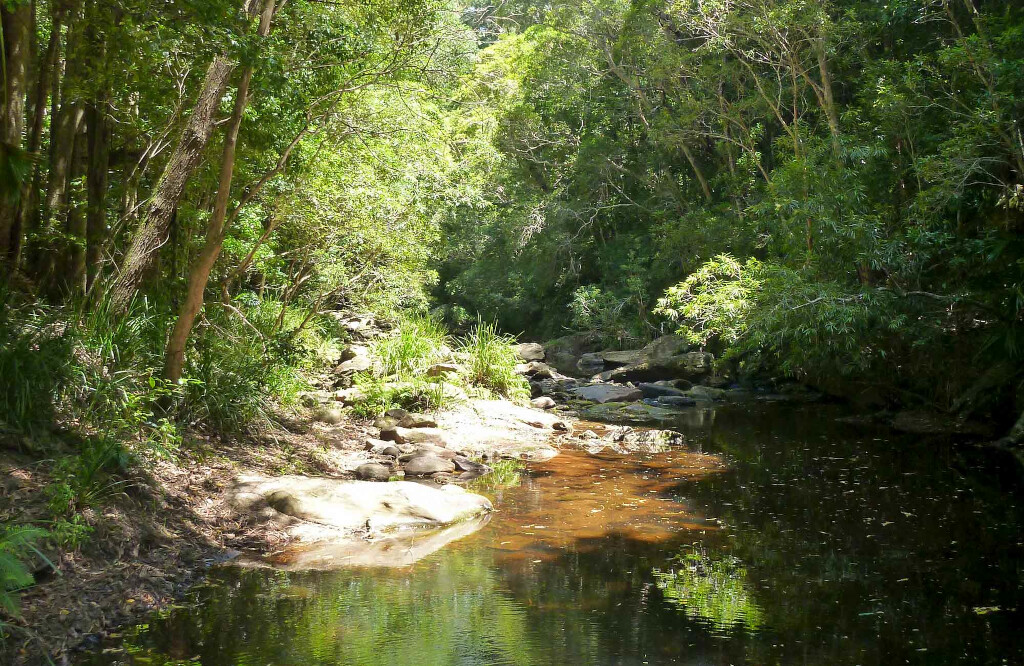
The leafy suburban sprawl of Greater Sydney slowly gives way to a rolling, green landscape of bushland stretching out to the horizon.
A great ring of forest surrounds it on all sides,
separating it from nearby Newcastle, Woolongong, and the Blue Mountains.
The further you get from Sydney, the larger these vast expanses of nothing between everything become.
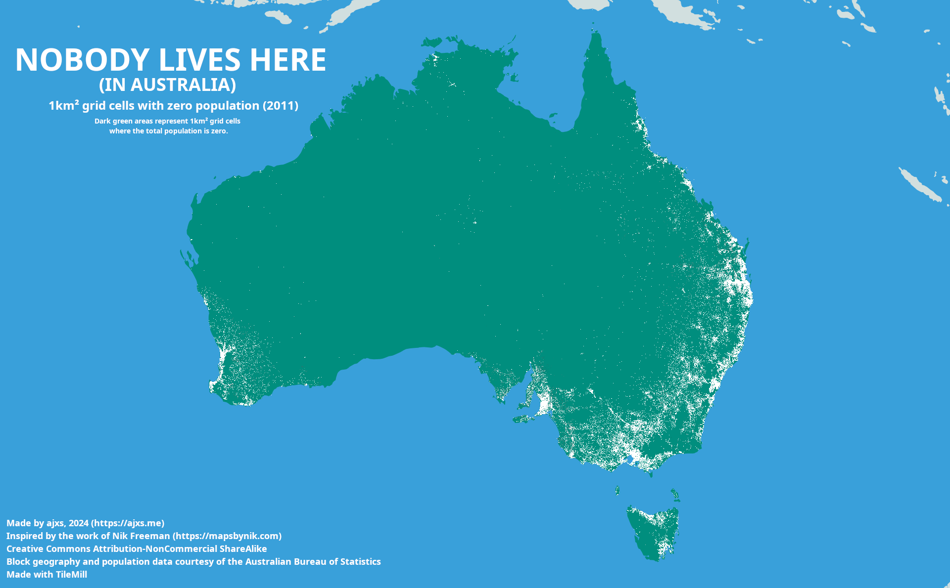
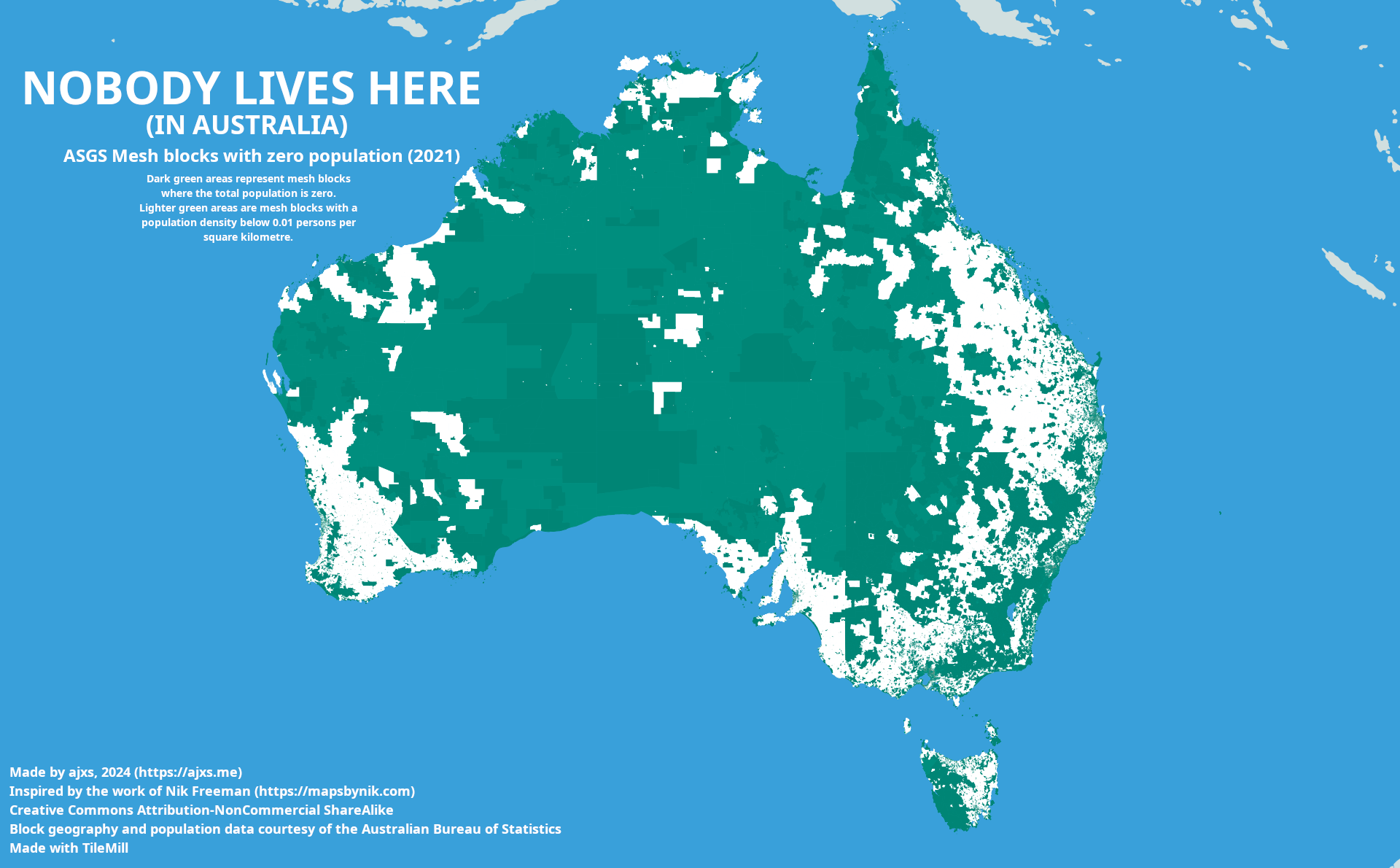
The original Nobody Lives Here presents a map of the United States subdivided into its individual Census Blocks, the smallest geographical unit used by the U.S. Census Bureau to count population. My first attempt at creating an Australian Nobody Lives Here took the same approach.
As part of the Australian Statistical Geography Standard (ASGS), the Australian Bureau of Statistics (ABS) subdivides the Australian landmass into Mesh Blocks , the smallest geographical area defined by the ABS. Fortunately, the ABS provides ESRI shapefiles for these Mesh Blocks on their website at no cost.
To construct my map, I took the 2021 Australian Census
Mesh Block Counts
data —a count of total usual resident population—
and used this data to identify the blocks where nobody lives,
and the population density of the blocks where people actually do.
The result (imitating Nik Freeman's wonderful design to the best of my ability)
looked aesthetically pleasing enough,
but unfortunately even after shading the blocks that were practically uninhabited it still just didn't get the point across.
Australia is emptier than this.
I went back to the drawing board. I was already building my map with the smallest geographical data the ABS made available, or was I? Was there something better out there that I just hadn't found? I decided to try my luck one last time and do a web search for 'Australia Population Density Map'... Maybe I should have done this first...
It turns out I'm not the first to try this after all.
After going to the trouble of tracking down the right census data,
painstakingly joining it to the ABS' Mesh Block geometry in
QGIS,
and styling the final map in
TileMill,
I now discovered that the Australian Bureau of Statistics had not only
beaten me to the punch4,
they'd beaten me by such a large margin that their page still has a 'Get Adobe Flash Player' button.
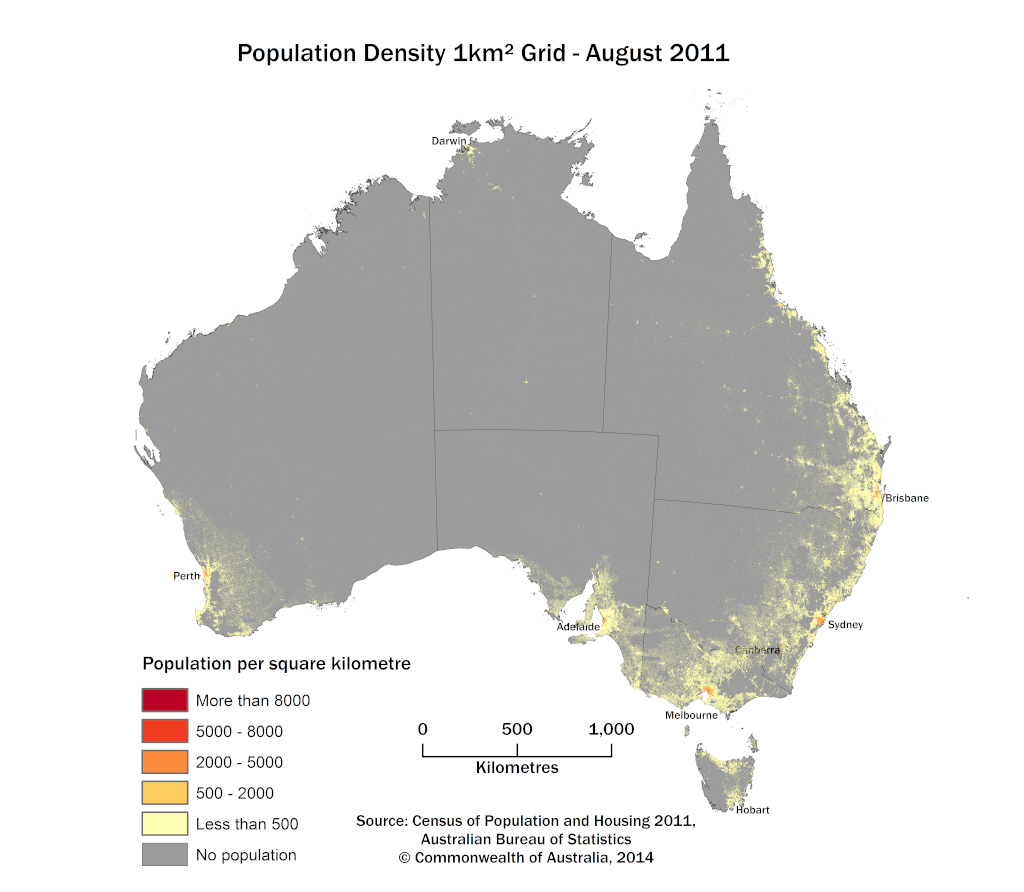
This release presents the first time population data has been published in 1km2 grid format by the Australian Bureau of Statistics. The grid displays Usual Resident Population (URP) from the 2011 Census of Population and Housing using 1km2 grid cells across Australia. The 1km² resolution of the grid therefore offers a measure of population density for Australia.The accompanying 'Explanatory Notes' page offers some interesting details on how the population grid was created using a combination of the Mesh Block data, and the Geocoded National Address File (G-NAF). In a spirit of openness that seems to be common in the GIS world the ABS published the data in ESRI/GeoTIFF. Just so I didn't leave empty-handed, I took the GeoTIFF file provided, loaded it into TileMill, and bashed it into the shape of the final product.
It might not be as beautiful as Nik Freeman's original design, but it gets the point across: Nobody Lives Here.
References #
- City of Sydney. (2020, April 9). The city at a glance. City of Sydney. https://www.cityofsydney.nsw.gov.au/guides/city-at-a-glance
- Our World in Data. (2022). Population density. Our World in Data. https://ourworldindata.org/grapher/population-density
- I was also particularly captivated by the accompanying discussion on Hacker News of Yellowstone National Park's 'Zone of Death' ↲
- This refers to the 'City of Sydney' local government area, not the much larger greater Sydney metropolitan area, which has a much lower population density of 429 people per square kilometre. ↲
- The ABS actually lists the Mesh Block design criteria on their website. They're not arbitrarily placed. Rather they're designed to reflect, and capture actual land use for statistical analysis. So I guess it makes sense that there aren't many uninhabited blocks. ↲
- Given that this was published only a few months after the original Nobody Lives Here, it's totally possible that this map was created in response. ↲